A review of the available data sources for and Qlik Sense vs Power BI as well as a comparison of the import processes across a number of data samples.
Available data sources
Both Qlik Sense and PowerBI allow connection to a growing number of data sources.
The specific list for Qlik Sense is here http://www.qlik.com/us/products/data-sources
The list for PowerBI is here: https://powerbi.microsoft.com/en-us/documentation/powerbi-desktop-data-sources/
I should mention that just because the particular data source you have is not listed doesn’t mean you are excluded from using either tool. There may just be an intermediate step before you can import the data or the data you have needs manipulation within the tool.
For the vast majority of data, there will be a solution out there that exists in both tools, the complexity in each, however, will vary.
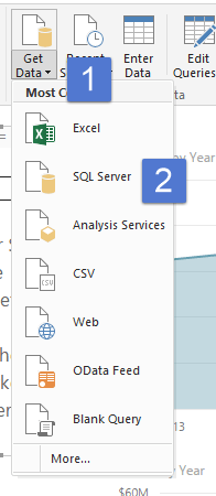
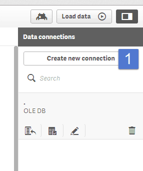
Common data sources: SQL Server
SQL Server is one of the most common sources of data that we will encounter in the workplace, so it is the first that I used to test both tools.
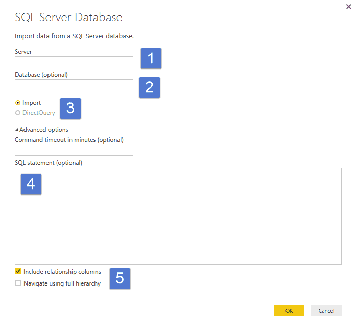
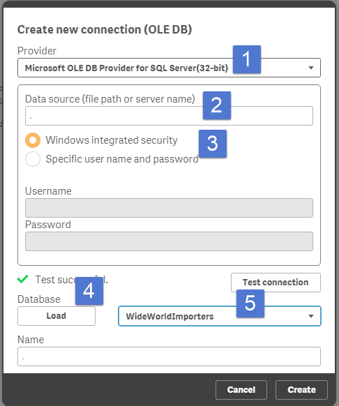
In this case, I used the World Wide Importers database in SQL Server 2016. I first created views in SQL server of the data I wanted and imported the data in both PowerBI and Qlik Sense.
In both cases this was very easy:
Here is loading a customer view from SQL server in PowerBI:

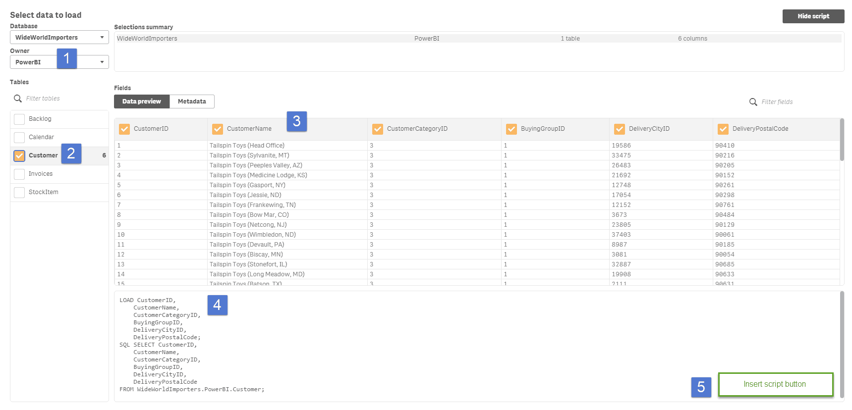
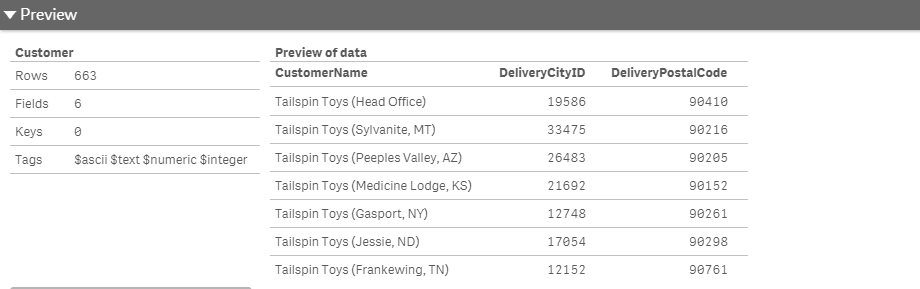
And now the same process in Qlik Sense with the same customer view from SQL server:
Total time to load 1 table in each tool is roughly 2 minutes. Time will obviously vary depending on the location of the server and the size and number of tables.
Key differences:
If you are pulling a table or a view from a database server, there is little difference in this process. If you require calculated columns or any data shaping the differences start to appear. I’m going to talk about this in the next section further.
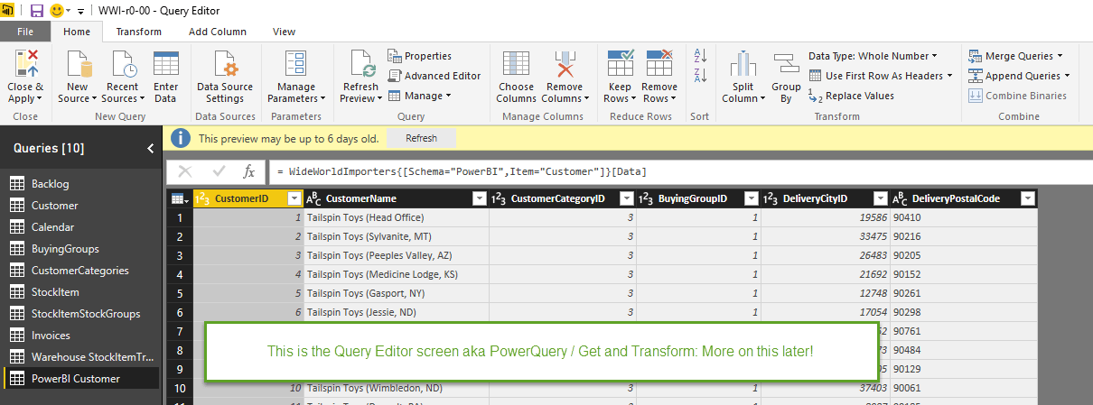
The difference once the data loads is the ability to preview the table data. In PowerBI, you can preview the entire data set in two different screens: the data screen and the edit query screen. In both cases, you can see every single field, and in the data screen, you can scroll through every row.
The data preview in Qlik Sense is very much a preview as seen above which is a truncated version showing only 3 of the fields. There are other ways to see the raw data, but they are not as simple as with Power BI especially if you have used a custom script to bring in the data.
Do you know the 7 components of Power BI? Take a read and test your knowledge.
CSV, text files and Web tables:
I tested both tools across the following data:
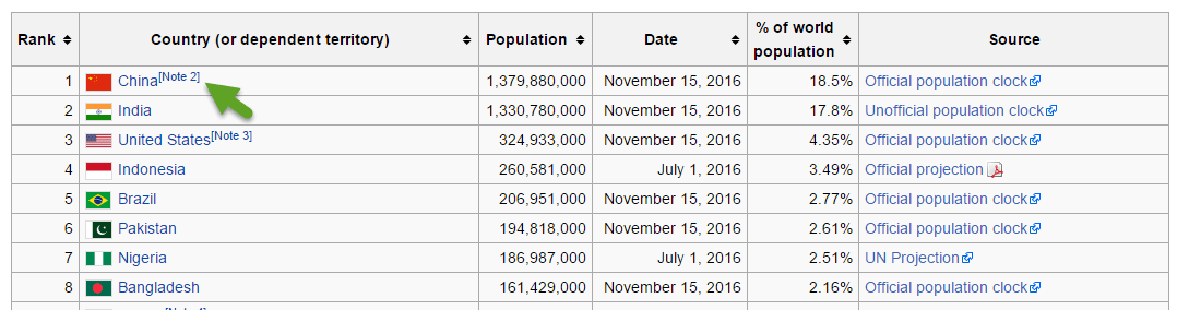
A list of countries and their populations from Wikipedia https://en.wikipedia.org/wiki/List_of_countries_and_dependencies_by_population
Key Differences:
PowerBI recognises all fields as text or type “Any”. All were easy to convert except that % of the world population which required the % symbol be trimmed off before conversion. The Note – shown above by the green arrow is ignored in Power BI. PowerBI also by default treated the headers as data. The headers are then promoted by the click of 1 button.
Qlik is remarkably savvy at recognising data types during import.Click To TweetQlik is remarkably savvy at recognising data types during import. It recognised all correctly without me having to override them. The Note shown with the green arrow is included as text. Qlik automatically treated the headers as headers, which is easily overiden if incorrect.
A standard set of comma-delimited data (CSV format)
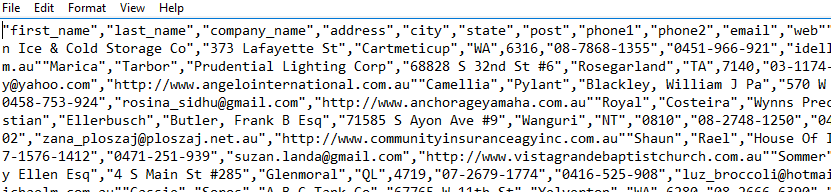
The raw data in notepad looks like this:
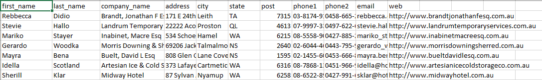
In Excel, the data looks like this:
Key Differences:
No real difference here because the data is clean and does not need shaping or appending. If however, we had several CSV files that had the same structure that we put in a folder, PowerBI can automate this while we would need to write a script in QlikSense.
Nasty Data:
What is my definition of Nasty data? It’s data that has one of the following:
- Inconsistent columns
- Repeating headers
- Multiple field headers
- Total lines on each page or for each group of data
- Field headers that don’t line up with the data
- No delimiters and inconsistent widths between columns (not fixed width)
Often we see this kind of data coming out of reporting tools like crystal reports. ERP systems love to generate this type of report.
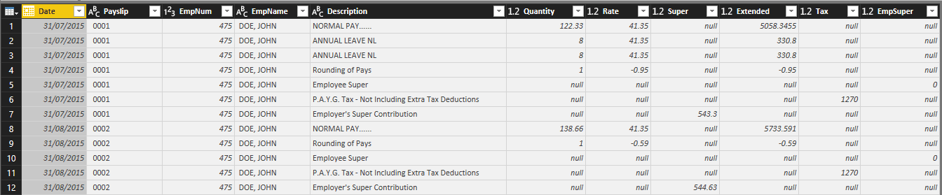
Below is an example of a payroll report (a very fake one, I might add) that is consistent with the reports or outputs that I call “nasty data”. Below are the first two pages of the 24-page payroll report for Fake Company Party.


In this example, the report is exported to Excel / CSV format and has the following issues:
- The report is 34 Columns wide, much of which has no data.
- There are repeating report headers
- It has repeating field headers that don’t line up with the data
- Different data shows up on different rows.
- Much of the data also contains text labels in the same field example “Date: 31/07/2015”.
- It has sub total rows
- It has a total for employee section.
All of which makes this data difficult to put into a table for data extraction.
Can both Power BI and Qlik Sense handle the import of this data?
In my opinion, Yes.
Would you use both: Highly unlikely.
This is where the Power Query advantage comes in for Power BI. Power BI utilises this same tool originally developed as an add-in for Excel to do data shaping which is renamed “Query Editor” in PowerBI desktop.
Nasty data is where the Power Query advantage shows up in Microsoft Power BIClick To TweetUsing the PowerBI Query editor, I was able to turn the above report into the below table in approximately 15 minutes. In this case, there was no requirement to write a single line of script. You can also do this work in Excel first using PowerQuery (Called Get and Transform in Excel 2016) and then copy the script from Excel (which it created for you) and Paste it into the Query Editor in PowerBI.
This power query shaping process also has the advantage that if you had multiple files with the same structure, you could put them in a directory and have PowerQuery put them all together with little effort.
I need to spend the time to see how long it takes me to write the script in Qlik Sense to do the same thing. In my opinion, a smart user wouldn’t do this in Qlik Sense. The user would save considerable time by using PowerQuery in Excel to transform the data before importing it into Qlik Sense.
Data import / Acquisition Summary
Both tools are capable of importing data from multiple sources. Qlik is driven from scripts that you write while PowerBI has a Graphical User Interface which simplifies the process.
For database data, there is no meaningful difference between the tools.
When dealing with more raw data and ad-hoc / one off requirements where the data might not be in an ideal state to start, or large groups of files such as CSV’s in a folder, PowerBI has a massive advantage with the query editor over Qlik’s scripting approach.
Viewing the raw data in PowerBI is easier.
Does one tool have a significant advantage:
For ad-hoc analysis, Power BI has advantages.
If you are working with system based data such as from an ERP both tools are on an even playing field.
Do you agree? What are the gaps you are currently facing importing data?
*** The second post in this series which looks at a comparison of building data models in both tools is now up.
Thanks for doing this report. I look forward to the other parts. Is it possible to upload the fake payroll report. As I have always been able to upload any “nasty data” using Qlik Script. If its only a one off I may do it in say Excel but if its ongoing then I set things up using script.
And after using both my preference is easily Qlik Sense. The transforming and loading data I prefer Sense but overall there isn’t much difference. The new automatic script bubbles feature (Data Manager) is still being developed but for simple table loads its already an excellent addition for new SENSE users.
Hey Robert, thanks for taking the time to comment! I totally agree with your comments about setting up a script if it’s a requirement that will repeat. I’m sending you the fake payroll report via email for your entertainment. Cheers!
Great report, in the process of reviewing these tools now, can’t wait for next installment. Thanks
Cheers Channing!
Hola, me gusto mucho el articulo, si me permites lo compartiré, un punto que es bueno mencionar es la capacidad para el manejo de cantidad de datos de ambas herramientas, por ejemplo segun tengo entendido power bi esta orientado a mostrar indicadores en base a datos procesados previamente, no esta destinado a la carga de una gran cantidad de registros, por ejemplo hasta el momento no se cuenta con la posibilidad de cargas incrementales, en cambio qlik puede manejar una cantidad muy alta de datos, incluyendo cargas incrementales, e probado ambas herramientas y los tiempos de carga de datos de qlik son mejores que los de power BI., asi como tambien me parece excelente la capacidad de personalización que posee power bi para sus objetos gráficos, asi como caracteristicas tan buenas como el poder ocultar tablas del modelo al usuario final, en fin queria opinar eso, espero te sirvan mis comentarios, hasta luego.
Here is Johnathan’s fantastic comment in English, I think google translate did a good job in this case:
Hello, I really liked the article, if you allow me to share it, a point that is good to mention is the ability to manage the amount of data of both tools, for example as I understand power bi is oriented to display indicators based on data Previously processed, is not intended to load a large number of records, for example so far there is no possibility of incremental loads, in contrast qlik can handle a very high amount of data, including incremental loads, and tested both Tools and data loading times of qlik are better than those of power BI., As well as I find excellent the capacity of personalization that has bi power for its graphic objects, as well as features as good as the power to hide tables of the model To the end user, I finally wanted to say that, I hope my comments will serve you, see you later.
Johnathan…thank you so much for this comment. I honestly wasn’t sure where to talk about this in the series, and I think you’ve written it better than I would have. There is a bit of an issue in comparing Power BI and Qlik Sense when it comes to larger data sets. In situations with large data sets, we would need to use Analysis Services and SSIS in conjunction with Power BI. There are some advantages to Qlik in this case because Power BI looses some of the Self Service functionality when used like this.
Oh no, Mike. Tou agree with Robert? Power Query is reliable to substitute a script. Power Query transformation is a list of steps (like macro) that will be repeated on request > Refresh button. Script writing is unnecessary.
Hi Vlado, my agreement with Robert was with respect to writing a script in Qlik Sense if and only if you had a repeatable “ugly” data source that you wanted to evaluate in Qlik Sense.
The transformation in Qlik is 90mins+ versus 10-15 in with Power Query.
Thanks for keeping me honest 🙂
Thanks for your blog. Is there a reason you chose to not use the data prep interface in Qlik Sense and go directly to script? The data prep in Qlik Sense is quite rich. If you haven’t played with Qlik bubbles, you should give it a try. Especially with content like full outer joins – no matter how many data sets there are. Fun to be able to see what you didn’t sell where – very useful too.
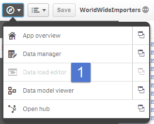
Hi Kathleen, I guess based on the “outer join” comment you work for Qlik. You make a good point that I didn’t include the “add data” / “bubbles” approach and instead went directly to the Data Load Editor. I gave some additional thought about this, so let me try to address below.
If you have a very simple model with a fact table and some dimension tables then perhaps I could see using it. The data manager does not add any transformation functionality. If anything it reduces it.
About “Nasty Data”, Qlik makes a statement in the manual to avoid duplicate headers and intermediate headers. That said from a purely Importing and transforming data perspective I see little difference in using the data manager other than a little bit of drag and drop automation.
I’m not sure if I mention it anywhere, but there is some scripting I did in the background to get calendar fields from the fact tables picked up correctly. When we start to get into tables from ERP or CRM systems, it’s not uncommon to have 2 – 6 date fields in a single table that you want to associate with your calendar. I’m not sure how this would be accomplished without scripting. I’m happy to U-turn if it’s possible.
Here’s my opinion part (it belongs more in the data modelling section): It feels to me like the “bubbles” are created to simplify the ETL process and in some ways made it more complicated. There is a very good chance that if a business user who doesn’t understand data relationships well could create a model which appears to look like it should work but produces incorrect outcomes. There is a comment from Jeff in the data modelling section that touches on this briefly.
Open to any further feedback on this.